When creating my blog I used one of the templates on blogger - but changed headers, colours and added photo elements along the right hand side to give it more personality. I choose to go with light colours in the background and with a bright spot colour in header texts. I choose a strong header image and decided a name for my blog that said something about myself.
On line portfolio considerations:
Target your market - Are you trying to get a job or showcasing your work, trying to get business?
Text - Short and precise I think is good. Get the attention fast and then keep it by keeping it short.
Simplicity - It is a portfolio site. Your work should stand out - draw attention to it.

The image above is from a website that shows projects from photographer Simon Hoegsberg. I really like the large horizontal image that you can navigate by scrolling along the smaller image below. It is simple and looks very cool. It is a cool peice of photography - but I think it can work for one of my projects as well. Where I have used a long layout that you scroll along.
I also think that the images you upload have to be large enough for you to some of the details. Of course you can also add a download pdf button - where you can view the work at the right size, but there is no point in putting up work that doesn't view properly.

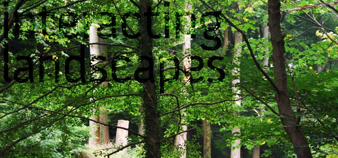
Above is the website of landscape practice Grant Associates. They have a clean and simples website. At the moment the site is under construction. It used to have have sketchbook part - where you could flick through some of their sketches for projects. That is a feature gives you a little insight into the practice. Other Landscape and architecture practices some times have parts where you can see research that they are carring out about eveything to green roofs and to energy saving structures. On some of the students that graduated last year you can see photography or video. I think it is very important to have a section like this.

These are looking at navigation. I like sites where you can scroll through a project - without the rest of the page scrolling as well.

Pentagram is multi design agency, who also has a architects part. I like the way they have utilised their work to make the website and as the same time use it as navigation. Where you click on the images and it will take you to that project.
I choose to look at website examples from across the design field for inspiration. I think you can learn a lot from other professional fields. Below are some thoughts on a couple of the websites from last years graduates.
The website I like the most is the one by Tom Ginnett. It is simple, works really well and showcase his work really well. His personality comes across in his use of the illustartions for the different sections. The only thing I think he has overlooked is an opportunity to get a bit more his personality across. Maybe an about or interests page could have done this. 

Paul Bratton 's website is not as nice in terms of layout and design, but he uses two extra sections - photography and artwork to show a bit of his interests. It shows addititional talents and I think it os important to show that off if you got it.
To sum up;
I like to make a simple, graphic site which uses cool navigation features and which really shows off my work. I will include a photography part and also a part about future apsirations.


No comments:
Post a Comment